When "Just Claude It" Isn't Enough: Hyperparam Beats Bespoke Scripts for Data Exploration
Hyperparam is a great way to rapidly clean and transform a large dataset. I’ve been working with them on UX, When I demo Hyperparam to ML practitioners, I’ve sometimes heard a version of the same question: "This looks cool, but couldn't I just ask Claude to whip up a quick script for this?" It's a fair objection. LLM-based coding is incredibly powerful, and the promise of going from question to custom analysis in seconds is compelling.
(I’m sharing this post today because Hyperparam is now in public release — which means you can follow these steps along if you want!)
So I decided to test it. I took a real dataset—one that needed actual cleaning and exploration—and worked through the same analysis twice: once with Hyperparam, once with Claude Code generating bespoke Python. The dataset is MathX, a collection of math problems with AI-generated solutions and reasoning chains. My goal was straightforward: figure out how often the dataset’s AI reasoning chain actually got the right answer. That would be a key step if I wanted to use this dataset for any training scenario — and it seemed like it would be pretty easy to check. I figured that was a reasonable approximation toward a data cleaning I might do in the real world.
The dataset is a Parquet file with three key columns: the problem, the expected answer, and the AI's generated solution (including all its reasoning). The question, answer, and logic chain used LaTeX-like math notation liberally.
Here's what I learned.
The Claude Code Approach: Powerful but Friction-Full
I started with Claude Code, working in a Jupyter notebook.
My first prompt was simple: "Extract the answer from the generated solution and compare it to the expected answer."
I had to iterate a few different times to get the code to be useful:
Pass 1: The script looked for non-existent columns, and came out with null results. That might be on me: I named the columns the wrong things in my prompt, and Claude didn’t correct me.
Pass 2: After we came to an understanding about column names, Claude wrote a regex to extract answers. The regex was... optimistic. It didn't account for the fact that many answers were wrapped in LaTeX
\boxed{}commands,, or that the "answer" might not be the last thing in the reasoning chain.Pass 3: I passed some failed examples into Claude, and it rewrote the regex in a much more intelligent way. This time it successfully extracted the boxed content.
Now it was time to move onto comparison. The naive comparison logic was broken—it was doing exact string matches on mathematical expressions that could be written in multiple equivalent forms. While some answers were clean — the number 28 is unambiguous — other parts of the dataset had an astonishing range of difficult examples.
I hopped into an iterative loop. I had the notebook show me ten examples that failed to match. I would:
Run the notebook cell
Look at the mismatches
Copy representative examples back into Claude's context
Ask it to improve the extraction or comparison logic
Rerun the cell
Claude and I made progress. We handled the \boxed{} stripping and answers that were wrapped in LaTeX like \text{}. We caught some edge cases. But the dataset really called for fuzzy matching — 0.5 compared of \frac{1}{2}, or “a=23” vs "the tower is 23 meters high”. The AI kept wanting to add increasingly complex parsing logic, and I kept feeling like I was fighting the tooling.
The fundamental issue was that each iteration required explicit decision-making. Should we use a regex or parse the LaTeX? How should we handle fractions versus decimals? Do we need an LLM call per row, or can we script this? Every time I wanted to make progress, I had to think through the implementation strategy first.
The Hyperparam Approach: Conversational Data Work
I opened the same MathX dataset in Hyperparam and typed:
"I'd like to find out how often the answer in 'Generated solution' matches the answer in 'expected_answer.' Can you give me a column that shows the answer in generated_solution, and another that tells me if it matches?"
Five minutes later, I had results on the first thousand rows.

The Hyerparam UI, and two columns.
Hyperparam extracted the answers and created a match column. As it ticked along, I could see the first few answers instantly, even as other rows were still working. When I looked at the results, I saw plenty of "NO" cases that I wanted to examine further—but the formatting was a mess. All those \boxed{} answers were back!
I then asked:
can you pull out the "\boxed" crud from the extracted_answer column?
Here's where something interesting happened. Instead of making an LLM call to interpret each solution, Hyperparam generated a JavaScript snippet:
let cleaned = answer.replace(/\\boxed\{/, '').replace(/\}$/, '');
It recognized that stripping the LaTeX box wrapper was a simple string operation—no LLM needed. Fast, cheap, and exactly right for the job.
This let me check some examples easily.
I was pleasantly surprised: the matcher LLM had figured out that 165/9 was the same as 55/3 , and that (Median = 91.5, Mode = 92) is the same as (Median 91.5, Mode 92).
This is one of Hyperparam's most exciting design choices: it can route work to either JavaScript for simple transformations or LLM calls for semantic tasks. I didn't have to think about that tradeoff—it just made the right call.
I was through the task in three or four minutes, and was easily able to move to next steps: counting the number of times that the chain-of-reasoning AI reset itself; looking at the string length of the AI’s reasoning process; and characterizing the problems by difficulty and type of problem.
Hyperparam Limitations
To be sure, Hyperparam wasn’t seamless. When I first loaded my file, the viewer didn’t want to display one of the columns. It turns out that the data compression used in the original Parquert file was a very inefficient one – and Hyperpram, trying to keep the data in browser memory, declined to show me some of the longest columns. Fortunately, hitting the “export” button in Hyperparam and then re-opening the exported file made that problem go away.
Hyperparam also doesn’t currently do cross-row operations well. In the notebook, I set a counter to see what percentage of rows were matches, so that I could see how much lift I’d gotten between rounds of improving my regexes. Hyperparam doesn’t show me those distributions.
Last, I wanted to explore the data numerically – to test hypotheses about whether the difficulty of the problem presented would have a correlation with the accuracy of the AI. I could spot-check individual rows in Hyperparam, but couldn’t do bulk operations. However, after exporting the data file, I was able to pull it into a python notebook and trivially threw together a few Seaborn scatterplots.
In Conclusion
Hyperparam made it easy to transform my data, either with an LLM call per line, or by generating a snippet of Javascript. The system got me answers in seconds, letting me move onward with my data cleaning and analysis. Yes, I could have gotten much of the way there with some time and a Claude prompt – but the efficiency of just dropping my file into Hyperparam and asking for my column transformations couldn’t be beat.
If you decide to check out Hyperparam, I’d love to know about your experience! Drop my a line — lets talk about how it can support data analysis for you!

Answering a Useless Question with the Degree-Degree Map

Basking in 68 degrees at 68 degrees.
A friend of mine was traveling in northern Europe, and posted a picture: “68 degrees and 68 degrees. One is latitude, the other temperature.”
That made me wonder — is that common? how often is the latitude the same as the temperature?
Some places are pretty easy to guess: I wouldn’t expect a 90 degree day at the poles, for example; nor does it hit 0 degrees at the equator very often.
But I live in Seattle — around 48 degrees North — and the temperature often passes through 48 degrees here on the way from near-freezing to fairly-toasty.
So presumably, there’s some zones where the temperature is fairly often matching the latitude, and others where it isn’t.
Needless to say, this makes for a completely useless great data science question — and a fun chance to play with some technology to make it go.
Identity Sources of Data
I’ve been working with Hyperparam, and their tool has trained an LLM to search Huggingface for datasets. While the tool is designed for — and best at — textual datasets, I figured it would be interesting to use it to find me a dataset that had gridded temperature data. Their LLM pointed me toward the EU-hosted Copernicus Climate Change Service (which is not on Huggingface). The ERA5 dataset has (computed) hourly temperature data across the whole world since 1950 on a quarter-degree grid.
Operationalize the Question
While I waited for the data to download — about 15 GB/year — I thought about how to operationalize the word “often.” With this dataset, it might be as simple as counting hours.
While the data was gridded to a quarter-degree, that felt excessively close. I eventually settled on a very simple equation:
number of hours in the dataset where the rounded temperature = rounded latitude
Visualize the Result
The nice thing about gridded lat-lon data is that it’s easy to plot on a map. Indeed, you can just put it on a generic rectangle and it looks pretty good. A little Python code, some matplotlib, and we had a tool that could rapidly plot temperature data on the earth.
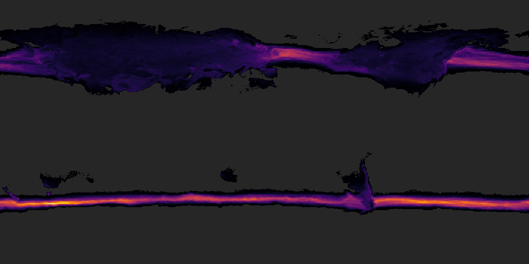
Total hours per year that the latitude is the same as the temperature.
I played with different color maps. Optimized the read speed on the data file. (15 GB — the first pass through the data took 2+ hours; by correcting the block read pattern, I got it down to ~12 minutes). Started automatically exporting the result files.
But what dodes the data say?
The lighter grey are places where there are zero hours per year that fit our criteria. Darker areas show at least some hours, brightening towards purple and yellows.
It’s a little hard to figure out the map, but perhaps the shape of northern Europe and Asia on the left, or North America toward the right, can offer a clue.
We can make a few observations here: North America and Europe at least sometimes have temperature-latitude parity. There’s a part of Patagonia — 40ish degrees — where it’s often 40 degrees.

Hours per year that the temperature is freezing (0-1 degrees C)
Most visible, though, are the oceanic streams between 40 and 50 degrees.
Adding nation outlines definitely helps the map make a little more sense.
Unable to resist temptation, I started playing with other questions — how often does this phenomenon recur in Centigrade? How often is it “room temperature” — defined as 68-72 Fahrenheit (20-22 C).
Share the Outcome
Last, I wrapped it into an interactive viz so that it was easier to explore. I exported images from the Python notebook, generating monthly and annual aggregates across four different measures. A little deckgl, a little react, and I got something that would display the data on both a globe and the flat map. Monthly animations both add visual interest, and show how climate zones vary with the season.
The 3D globe gives a rich sense of zooming in and out, while the 2D map lets you see the world at once.


I’ll be honest. I’m pretty sure this is completely useless. I have no idea at all what I’d do with this data — but it was fun to test out my intuition, play a little with the data, and see what I could learn.
It’s always fun to dig my fingers into a new dataset. Here, putting together a data pipeline that could process this much data into a useful and interesting form was interesting and valuable, too.

Designing for Genre
The last few entries in this blog introduced the concept of “genre” as a way to frame visualization. I analogized visualization to literary genres: different genres of visualizations use the same perceptual building blocks and grammar but put those pieces together with distinct purposes. The core genres were exploration, presentation, and monitoring. We also discussed domain-specific visualization.


These genres also have subgenres: some presentations are meant to be read for scientific analysis, others for emotional resonance.
But why does genre matter? Can’t we say these are different tasks and call it a day?
Genre Helps Understand User Intent
When talking with a client recently, I was struck by how genre matters. They were building a question-answering system. The user can ask questions like, “How were sales last month across four different stores?” The client wanted to create an interface to answer the question.
We realized that question was incomplete — we needed to know why the user was asking.
Maybe they were trying to learn about business dynamics. They might follow the question with another “What products sold better in San Francisco than Seattle?” or “How did that change since last quarter?” or other exploratory questions. A system that provides paths to future exploration would benefit those users.
Other users might want to paste the resulting image into a presentation or a report. Those users will probably care most about styling, design, and readability.
Other users might want to check that figure monthly to monitor how sales are shifting. They plan to put the answer into a dashboard and set up a data pipeline for future queries.
This different intent turns out to be necessary. Genre helps us understand how to answer a user’s needs correctly.
Genre Shapes User Experience
This also implies that genre can help us design a user interface. Tools often confuse these distinctions: presentation features are placed next to exploratory features in charting tools.

Google Sheet’s Chart Editor
Tools for different genres in the same UI
Check out this screenshot from Google Sheets as an example. It offers the user “compare mode” and “background color” next to each other. These are very different tools! “Compare mode” lets you examine the value at any data point, essential for interactive exploratory analysis. On the other hand, “background color” and “border color” are primarily for presentations.
We often see the genres mixed up in the same tool. In Excel, for example, some functions seem to be designed for different genres. For example, Excel pivot tables are excellent for exploration but seem almost unfriendly for presentation. (Perhaps that’s intentional!). Excel’s 3D charts might work well for presentations but are less useful for explorations. Chart types like the stock high/low/close charts are domain-specific to the finance sector.
Unfortunately, all these different uses are mixed into the same menus, leading to user confusion.
Genre Shapes Data Flow
I was talking to a former Chief Data Officer for a Fortune 500 company. He explained to me that his company had spent tremendous amounts of money maintaining data pipelines that were not in use and had hired an audit team merely to determine which pipelines to turn off.
In his telling, their company had designed their data warehouse so that any query became a data pipeline, ready for periodic updates in a dashboard. The system did not distinguish between a data scientist pulling data once for exploration, an executive getting data for a presentation, and a continuing pull for a dashboard. As you might imagine, storage and transfer costs exploded.
Having a way to understand genre would have been invaluable in taking into account their different needs.
Moving Between Genres
This is not to say that questions are confined to one genre. In fact, the same question will often flow between genres. A data scientist might go on an exploration and learn an interesting fact. Later, they’ll present that fact to their stakeholders and perhaps even set up a monitoring solution to see whether that fact continues to hold.
The reverse might happen, too: an executive might see a surprising result on a dashboard and decide to understand what changed, so initiate an exploration.
Designing with Genre
To design a visualization, we must first understand what it will be used for. The concept of “genre” can help describe everyday tasks and use cases. Designing with the genre in mind helps clarify what parts are most important.
Visualization Genres: Domain-Specific Visualization
In the last few blog entries, I’ve talked about a few major genres of visualization — exploration, presentation, and monitoring. We’re getting toward the end of this series (phew!).
I started to coalesce the other posts, so I could compare and contrast the three; and on the way, I bumped into domain-specific visualization.
Let’s start with the first three.
| Genre | Exploration | Presentation | Monitoring |
| Questions are ... | New | Known | Known |
| Answers are ... | New | Known | New |
| Data is ... | Static | Static | Changing |
| Interactivity | Extensive | Curated | Curated |
| Visualization Mapping | Rapid to analyze | Depends on intent | Consistent |
| Audience | Self / Analyst | Broad | Variable |
In the last row, I put the question of how you choose the “visualization mapping” — do you choose bars and pies, or more exotic representations? In exploration, analysts almost always want to use the simplest visualization possible, such as quick summary statistics and distributions. A presentation has more room for creativity — the designer can choose a visualization mapping that might take some education. A dashboard has more flexibility; people will return to it from time to time.
This grid is missing a major category:
Domain-Specific Visualization
The missing piece is domain-specific discovery: visualizations that are built for a specific shape of data and a specific set of questions. These address more specific problems than freeform exploration, but allows for new data, unlike fixed presentations.
Previously, we discussed how a data presentation can use novel visualization mappings. We also talked about how interactive filters and highlights can allow a user to focus on particular aspects of the data.
Domain-specific tools generalize this to previously-unknown data. Domain-specific visualizations are built by a designer who knows enough about the domain of the data to want to create a specialized visualization, but expects the user to bring their own data.
Google Maps can be seen as a family of domain-specific visualizations: for example, the driving directions overlay complex data (alternate routes, expected drive time) over a familiar cartographic map. We might argue that tools like Strava are domain-specific: the tool shows the same maps, charts of speed and heartrate, and segment records across different exercises.

When I worked at Honeycomb, we built a waterfall trace viewer for distributed trace observability. Trace data must be hierarchical, with certain well-known attributes (“errors”, “service name”, “duration”), and certain relationships between data points. For data that is shaped like a trace, though, there’s nothing better.
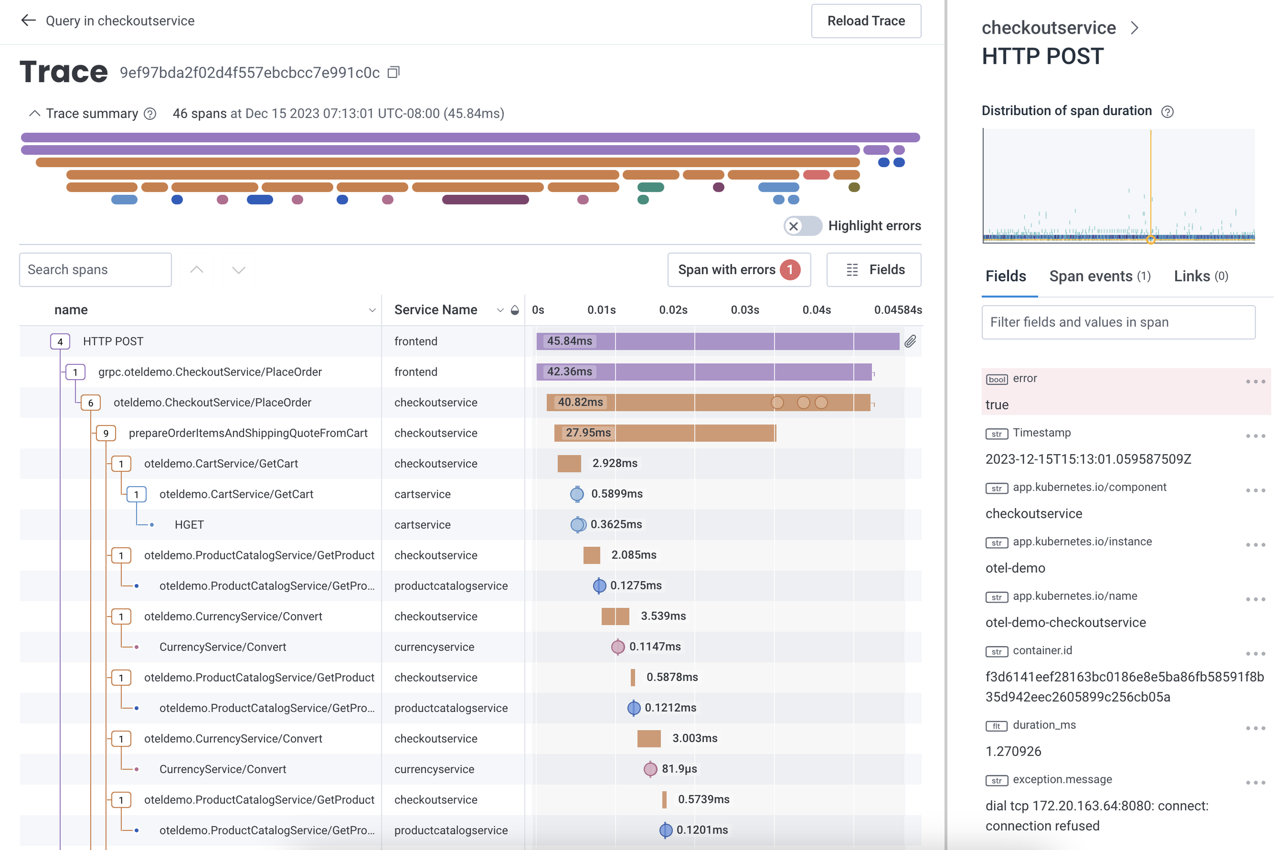
The Honeycomb.io trace viewer showing a single trace's as a "waterfall" visualization. The trace view helps show that no single operation within the trace seems to be particularly slow -- no bottom-level rectangle takes up a lot of the total duration.
Indeed, I spent much of my research career building and evaluating novel visualization mappings, or applying known mappings to novel datasets. The “CorpTreemap” (2013) drew a treemap over a large company’s hierarchical organization chart. Using the map as a background, the user could then apply different lists of people over the map to understand how those groups varied.
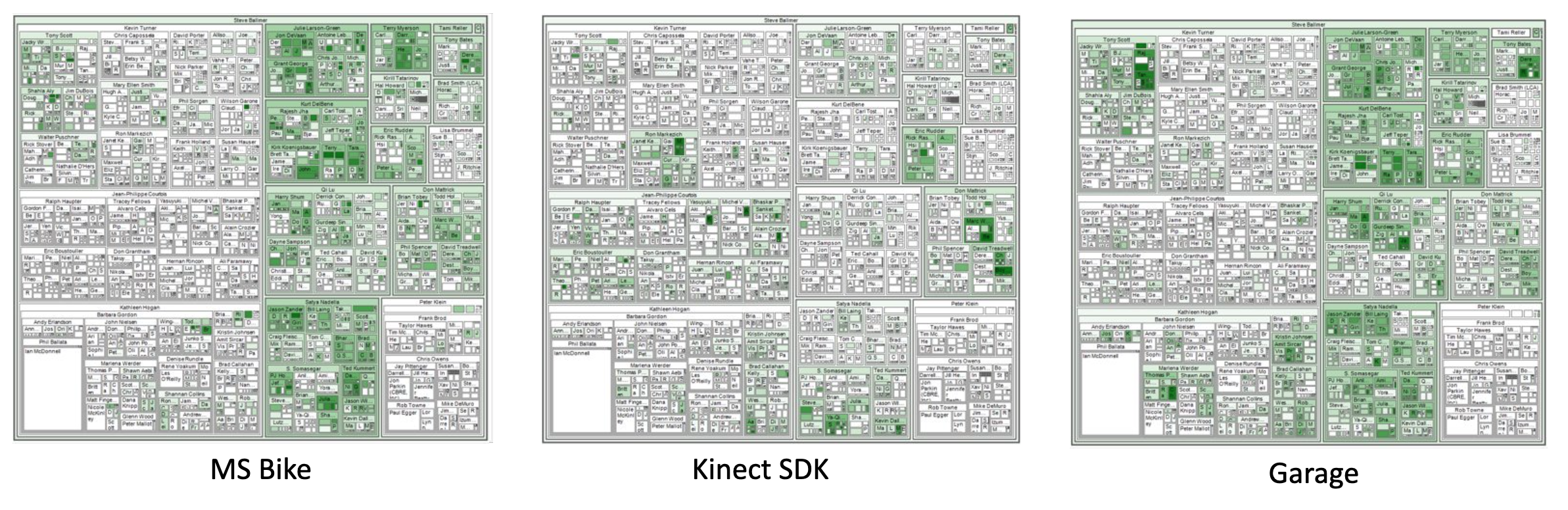
Microsoft's organizational chart, visualized as a treemap, and with membership on three mailing lists as highlights. (Bicyclists; users of a gaming development toolkit; and people interested in the "Garage" makerspace.) Sales and marketing groups are on the left side of the map, product groups on the right side. These overviews show how interest in a topic may be linked to a group's area of interest.
There’s a common theme: in a domain-specific discovery, we make a user’s complex dataset understandable by choosing a representation that makes sense to the user. We trade off the flexibility of an exploration for the clarity of a domain-specific visualization.
Next entry, we’ll put these together to talk about why genre matters.
Visualization Genres: Monitoring and Dashboards
We’ve talked about exploration — learning new things about your data; and we’ve talked about presentation — teaching other people things about data. The third major genre of visualization is monitoring and dashboards —learning about new data in real time.
(In the next entry, I’ll say a little about things that don’t fit well into these categories.)
I’ll use the words “monitoring” (as the task) and “dashboard” (as the tool that we use to carry out the taxsk) somewhat interchangably. A dashboard is a set of fixed visualizations connected to live data, with the goal of letting a user have a consistent view of a standing question — and so, to monitor a situation.
The dashboard curator chooses a set of visualizations, backed by data queries. When a user looks at the dashboard, they see a recently-updated view.
Paradoxically, dashboards are perhaps the least-loved genre in the visualization world, yet the most used. Michael Correll has described them as “rude”; visualization researchers often dismiss them as uninteresting. They don’t come with the thrill of discovery, as exploratory visualization does; and they don’t encourage novel renderings, like presentations do.

Four dashboard exemplars showing different use cases. From Sarikaya et al's What Do We Talk About When We Talk About Dashboards? (IEEE VIS 2019).
Sometimes, a dashboard is used to communicate updates to others, as in the COVID-19 dashboards that were a regular part of life in 2020 and 2021. Other times, dashboards are a way of pinning down a frequently-asked question: at Honeycomb, we often saw our customers create dashboards that allowed them to easily check whether their system was working well, or whether a known issue was recurring.
Addressing known issues seems to be the key to dashboards: they pin down past questions, more then they explore future ones. A decision-support dashboard shows the answer to past questions: “last time this happened, we wanted to know the answer to this question. What about this time?”.
A well-designed dashboard invites two next steps:
Letting the reader compare a value to a past state, or desired ranges. Not all dashboards are good at comparison: is “12,750” in the top-left of the social dashboard, above, growing or shrinking? Is it a good number or a bad one? The reader might know, but the visualization doesn’t seem to say. Gauges, like the operational dashboard above, let the reader compare to a desired normative value, but may not provide information .
Asking questions about why a particular change has happened, and further exploration. (“Why is this number high?”)
At their worst, dashboards are retreads: Honeycomb CTO Charity Majors talks about a dashboard as “an answer to some long-forgotten question”, “an invitation to pattern-match the past instead of interrogate the present.”
That’s our three major genres — next time, I’ll talk a little about things that don’t fit so well into the categories, and try to put these in a grid together.
Read more
A few years ago, I got together with some colleagues from Tableau and Microsoft got together to write an academic article, “What do we talk about Dashboards”, which tries to break down families of dashboard uses. Some of those authors followed up with “Heuristics for Supporting Cooperative Dashboard Design”, exploring ways to think about how to frame dashboards more usefully, using a conversational metaphor.
If you want a more tactical approach, Stephen Few’s “Information Dashboard Design” is a useful discussion of how to create practical dashboards.
And, of course — if you’ve got visualization challenges of your own, I’d love to help out! Drop me a line, and let’s talk about how to help our users and customers make sense of critical data.


