Visualization Genres: Domain-Specific Visualization
In the last few blog entries, I’ve talked about a few major genres of visualization — exploration, presentation, and monitoring. We’re getting toward the end of this series (phew!).
I started to coalesce the other posts, so I could compare and contrast the three; and on the way, I bumped into domain-specific visualization.
Let’s start with the first three.
| Genre | Exploration | Presentation | Monitoring |
| Questions are ... | New | Known | Known |
| Answers are ... | New | Known | New |
| Data is ... | Static | Static | Changing |
| Interactivity | Extensive | Curated | Curated |
| Visualization Mapping | Rapid to analyze | Depends on intent | Consistent |
| Audience | Self / Analyst | Broad | Variable |
In the last row, I put the question of how you choose the “visualization mapping” — do you choose bars and pies, or more exotic representations? In exploration, analysts almost always want to use the simplest visualization possible, such as quick summary statistics and distributions. A presentation has more room for creativity — the designer can choose a visualization mapping that might take some education. A dashboard has more flexibility; people will return to it from time to time.
This grid is missing a major category:
Domain-Specific Visualization
The missing piece is domain-specific discovery: visualizations that are built for a specific shape of data and a specific set of questions. These address more specific problems than freeform exploration, but allows for new data, unlike fixed presentations.
Previously, we discussed how a data presentation can use novel visualization mappings. We also talked about how interactive filters and highlights can allow a user to focus on particular aspects of the data.
Domain-specific tools generalize this to previously-unknown data. Domain-specific visualizations are built by a designer who knows enough about the domain of the data to want to create a specialized visualization, but expects the user to bring their own data.
Google Maps can be seen as a family of domain-specific visualizations: for example, the driving directions overlay complex data (alternate routes, expected drive time) over a familiar cartographic map. We might argue that tools like Strava are domain-specific: the tool shows the same maps, charts of speed and heartrate, and segment records across different exercises.

When I worked at Honeycomb, we built a waterfall trace viewer for distributed trace observability. Trace data must be hierarchical, with certain well-known attributes (“errors”, “service name”, “duration”), and certain relationships between data points. For data that is shaped like a trace, though, there’s nothing better.
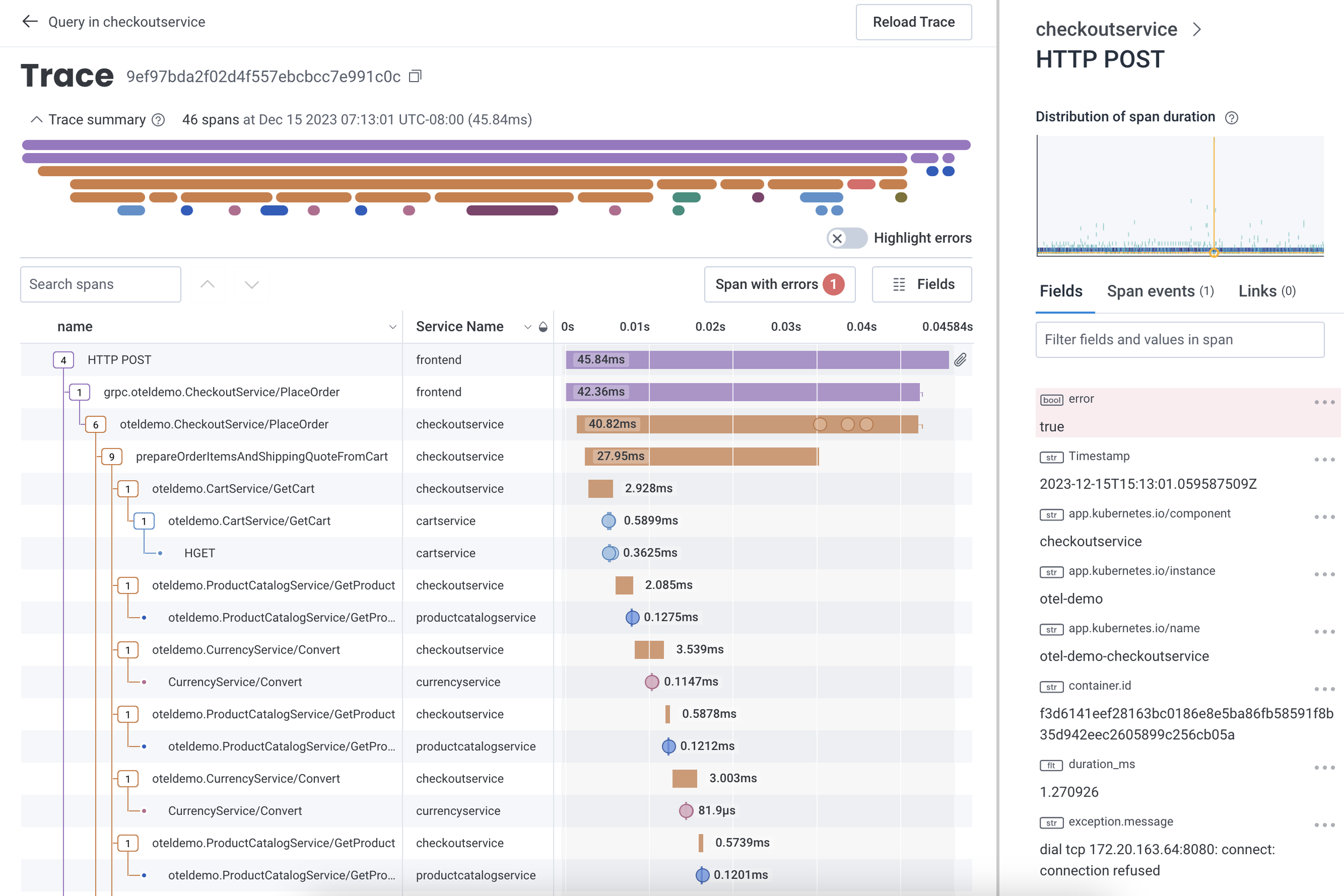
The Honeycomb.io trace viewer showing a single trace's as a "waterfall" visualization. The trace view helps show that no single operation within the trace seems to be particularly slow -- no bottom-level rectangle takes up a lot of the total duration.
Indeed, I spent much of my research career building and evaluating novel visualization mappings, or applying known mappings to novel datasets. The “CorpTreemap” (2013) drew a treemap over a large company’s hierarchical organization chart. Using the map as a background, the user could then apply different lists of people over the map to understand how those groups varied.
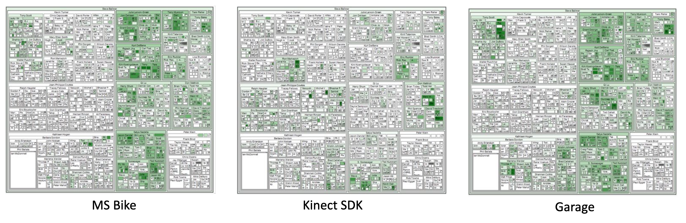
Microsoft's organizational chart, visualized as a treemap, and with membership on three mailing lists as highlights. (Bicyclists; users of a gaming development toolkit; and people interested in the "Garage" makerspace.) Sales and marketing groups are on the left side of the map, product groups on the right side. These overviews show how interest in a topic may be linked to a group's area of interest.
There’s a common theme: in a domain-specific discovery, we make a user’s complex dataset understandable by choosing a representation that makes sense to the user. We trade off the flexibility of an exploration for the clarity of a domain-specific visualization.
Next entry, we’ll put these together to talk about why genre matters.