Answering a Useless Question with the Degree-Degree Map

Basking in 68 degrees at 68 degrees.
A friend of mine was traveling in northern Europe, and posted a picture: “68 degrees and 68 degrees. One is latitude, the other temperature.”
That made me wonder — is that common? how often is the latitude the same as the temperature?
Some places are pretty easy to guess: I wouldn’t expect a 90 degree day at the poles, for example; nor does it hit 0 degrees at the equator very often.
But I live in Seattle — around 48 degrees North — and the temperature often passes through 48 degrees here on the way from near-freezing to fairly-toasty.
So presumably, there’s some zones where the temperature is fairly often matching the latitude, and others where it isn’t.
Needless to say, this makes for a completely useless great data science question — and a fun chance to play with some technology to make it go.
Identity Sources of Data
I’ve been working with Hyperparam, and their tool has trained an LLM to search Huggingface for datasets. While the tool is designed for — and best at — textual datasets, I figured it would be interesting to use it to find me a dataset that had gridded temperature data. Their LLM pointed me toward the EU-hosted Copernicus Climate Change Service (which is not on Huggingface). The ERA5 dataset has (computed) hourly temperature data across the whole world since 1950 on a quarter-degree grid.
Operationalize the Question
While I waited for the data to download — about 15 GB/year — I thought about how to operationalize the word “often.” With this dataset, it might be as simple as counting hours.
While the data was gridded to a quarter-degree, that felt excessively close. I eventually settled on a very simple equation:
number of hours in the dataset where the rounded temperature = rounded latitude
Visualize the Result
The nice thing about gridded lat-lon data is that it’s easy to plot on a map. Indeed, you can just put it on a generic rectangle and it looks pretty good. A little Python code, some matplotlib, and we had a tool that could rapidly plot temperature data on the earth.
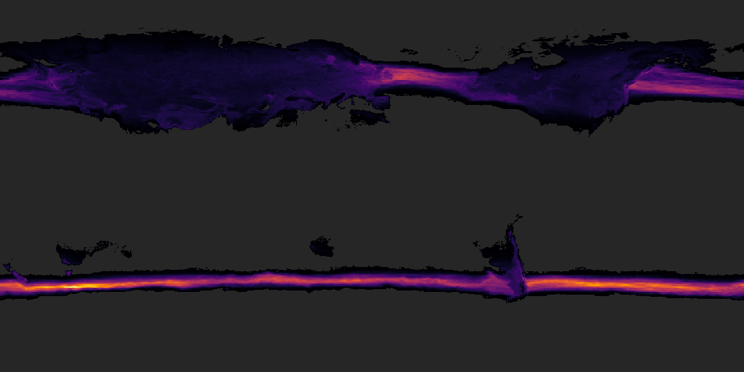
Total hours per year that the latitude is the same as the temperature.
I played with different color maps. Optimized the read speed on the data file. (15 GB — the first pass through the data took 2+ hours; by correcting the block read pattern, I got it down to ~12 minutes). Started automatically exporting the result files.
But what dodes the data say?
The lighter grey are places where there are zero hours per year that fit our criteria. Darker areas show at least some hours, brightening towards purple and yellows.
It’s a little hard to figure out the map, but perhaps the shape of northern Europe and Asia on the left, or North America toward the right, can offer a clue.
We can make a few observations here: North America and Europe at least sometimes have temperature-latitude parity. There’s a part of Patagonia — 40ish degrees — where it’s often 40 degrees.

Hours per year that the temperature is freezing (0-1 degrees C)
Most visible, though, are the oceanic streams between 40 and 50 degrees.
Adding nation outlines definitely helps the map make a little more sense.
Unable to resist temptation, I started playing with other questions — how often does this phenomenon recur in Centigrade? How often is it “room temperature” — defined as 68-72 Fahrenheit (20-22 C).
Share the Outcome
Last, I wrapped it into an interactive viz so that it was easier to explore. I exported images from the Python notebook, generating monthly and annual aggregates across four different measures. A little deckgl, a little react, and I got something that would display the data on both a globe and the flat map. Monthly animations both add visual interest, and show how climate zones vary with the season.
The 3D globe gives a rich sense of zooming in and out, while the 2D map lets you see the world at once.


I’ll be honest. I’m pretty sure this is completely useless. I have no idea at all what I’d do with this data — but it was fun to test out my intuition, play a little with the data, and see what I could learn.
It’s always fun to dig my fingers into a new dataset. Here, putting together a data pipeline that could process this much data into a useful and interesting form was interesting and valuable, too.