
Designing for Genre
The last few entries in this blog introduced the concept of “genre” as a way to frame visualization. I analogized visualization to literary genres: different genres of visualizations use the same perceptual building blocks and grammar but put those pieces together with distinct purposes. The core genres were exploration, presentation, and monitoring. We also discussed domain-specific visualization.


These genres also have subgenres: some presentations are meant to be read for scientific analysis, others for emotional resonance.
But why does genre matter? Can’t we say these are different tasks and call it a day?
Genre Helps Understand User Intent
When talking with a client recently, I was struck by how genre matters. They were building a question-answering system. The user can ask questions like, “How were sales last month across four different stores?” The client wanted to create an interface to answer the question.
We realized that question was incomplete — we needed to know why the user was asking.
Maybe they were trying to learn about business dynamics. They might follow the question with another “What products sold better in San Francisco than Seattle?” or “How did that change since last quarter?” or other exploratory questions. A system that provides paths to future exploration would benefit those users.
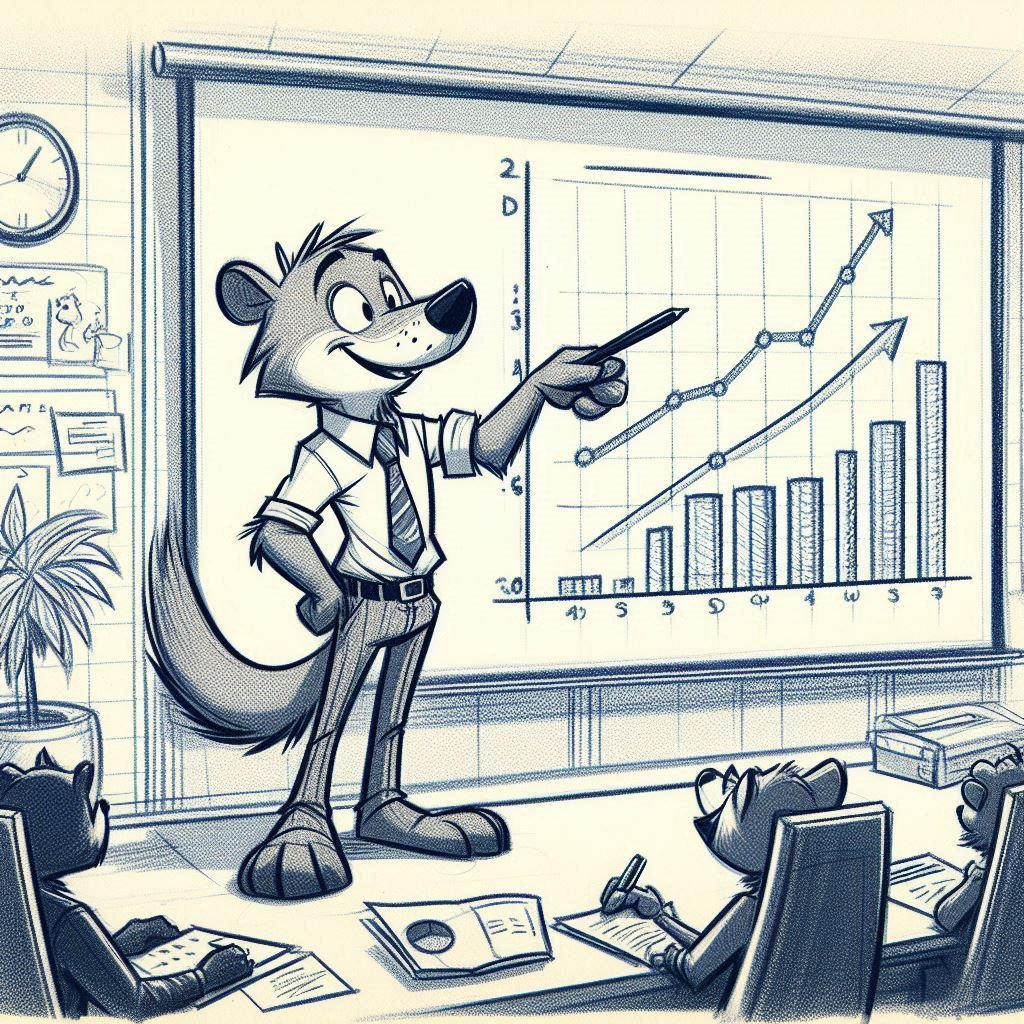
Other users might want to paste the resulting image into a presentation or a report. Those users will probably care most about styling, design, and readability.
Other users might want to check that figure monthly to monitor how sales are shifting. They plan to put the answer into a dashboard and set up a data pipeline for future queries.
This different intent turns out to be necessary. Genre helps us understand how to answer a user’s needs correctly.
Genre Shapes User Experience
This also implies that genre can help us design a user interface. Tools often confuse these distinctions: presentation features are placed next to exploratory features in charting tools.

Google Sheet’s Chart Editor
Tools for different genres in the same UI
Check out this screenshot from Google Sheets as an example. It offers the user “compare mode” and “background color” next to each other. These are very different tools! “Compare mode” lets you examine the value at any data point, essential for interactive exploratory analysis. On the other hand, “background color” and “border color” are primarily for presentations.
We often see the genres mixed up in the same tool. In Excel, for example, some functions seem to be designed for different genres. For example, Excel pivot tables are excellent for exploration but seem almost unfriendly for presentation. (Perhaps that’s intentional!). Excel’s 3D charts might work well for presentations but are less useful for explorations. Chart types like the stock high/low/close charts are domain-specific to the finance sector.
Unfortunately, all these different uses are mixed into the same menus, leading to user confusion.
Genre Shapes Data Flow
I was talking to a former Chief Data Officer for a Fortune 500 company. He explained to me that his company had spent tremendous amounts of money maintaining data pipelines that were not in use and had hired an audit team merely to determine which pipelines to turn off.
In his telling, their company had designed their data warehouse so that any query became a data pipeline, ready for periodic updates in a dashboard. The system did not distinguish between a data scientist pulling data once for exploration, an executive getting data for a presentation, and a continuing pull for a dashboard. As you might imagine, storage and transfer costs exploded.
Having a way to understand genre would have been invaluable in taking into account their different needs.
Moving Between Genres
This is not to say that questions are confined to one genre. In fact, the same question will often flow between genres. A data scientist might go on an exploration and learn an interesting fact. Later, they’ll present that fact to their stakeholders and perhaps even set up a monitoring solution to see whether that fact continues to hold.
The reverse might happen, too: an executive might see a surprising result on a dashboard and decide to understand what changed, so initiate an exploration.
Designing with Genre
To design a visualization, we must first understand what it will be used for. The concept of “genre” can help describe everyday tasks and use cases. Designing with the genre in mind helps clarify what parts are most important.
Visualization Genres: Exploration
In the last entry, I introduced three genres of visualization —presentation, exploration, and monitoring. I’d like to dive into these in a little more detail.
The first genre I want to talk about is data exploration. Exploration – formally, “Exploratory Data Analysis” – pares visualization down to its barest elements: it asks nothing but how to deliver an insight rapidly.
An analyst starts an exploration with almost no idea of the outcome. They might start with a concrete question – “how are sales doing in our new store?” – but will rapidly begin to explore possibilities, trying to unpack reasons and correlates and related factors. Are sales up? What’s changed? Why did this month look better than last, and can we replicate it? They will ask dozens of questions, trying to learn what is going on in the data and why, trying to build a story.

A Python Notebook showing a pairplot — the combinations of dimensions — to rapidly explore distributions and relations.
Some explorations may even start with a blank slate, knowing little about the data. The first steps in an exploration might be to evaluate the quality and meaning of the data – checking what the dimensions of the data are, how the values are distributed, and how different dimensions relate to each other. An exploration might require merging data from multiple sources, cleaning stray values, and looking at multiple histograms, scatterplots, and different groupings of the data.
Explorations are usually led by data analysts, or subject-matter experts. Their tools are data-oriented, including R, Jupyter notebooks, Tableau or PowerBI. Tools for data exploration prioritize rapid iteration – it should be easy to change axes, swap out dimensions, or change groupings; and it should happen quickly, with just a few keystrokes or a click of the mouse.
To make sure they can keep diving into the data, the analyst carrying out an exploration almost always runs it against a static excerpt of data, ensuring that their discovery is easy to replicate – and ensuring that their data excerpt can be computed quickly. Once they’ve found an insight, an analyst will often then run it against a different time period or a different sample of their data to validate that their insight is robust.
It’s worth talking in some detail about data exploration because people find it … underwhelming. At Microsoft, I often had colleagues come to my office with a dataset that they wanted to explore. What new insights would they find?
Somewhat to their disappointment, I didn’t turn to flying dots or animated graphs or 3D visualization — despite the fact that I was working on those very technologies. Instead, I’d start with a few histograms, getting to know the distribution.
Now, later, when we were presenting the results — but that’s next week’s posting.
There are a few sub-genres of exploration that are worth noting. The description above suggests data exploration of the frontier: when you could be faced with almost anything. Often, though, that’s not quite true.
Some tools support context-specific data exploration. An MRI machine display allows an analyst to scan through layers of sophisticated imagery, but does not allow generalized display. System monitoring tools, like Datadog or Google Analytics, allow users to ask questions tuned specifically to the DevOps domain. In each of these domains, there are some interesting changes:
The tool might offer domain-specific visualizations. A system monitoring tool might offer trace visualizations or flame graphs; a geographic tool might natively offer maps; the MRI display makes sense of underlying data by visualizing and partially analyzing the results.
The tool might offer opinionated computations: while “95th percentile” might not be a one-liner in general math libraries, it is fundamental to the DevOps workload.
Overall, context-specific exploratory visualizations use additional domain information to help analysts ask more-restrictive questions, in exchange for rich, domain-specific tools.. I’m going to talk more about tools that sit between genres at the end of this series.
The genre of exploration overall privileges rough-and-ready computation over precise details; it looks to come up with insights rapidly; and is largely uninterested in the aesthetic of the visualization.
In my next entry, I’ll talk about the next genre: data presentation — a very different domain.
Understanding Visualization Genres
Forgive me: this is a bit of a rant. To make sure it’s a good one, we’re doing it in five parts.
Where and how will this visualization be used?
This question drives every choice made when designing a visualization – from the design of the chart itself, all the way down to the choices of how the data architecture needs to be arranged. The creator of the visualization must make different choices depending on the use case and context.
I think of this in the same way I think of “genre” in writing. You wouldn’t mistake a memoir for a news article or a technical manual – they use different ideas of what to include, different writing styles, even different choices of words. Even though all three might be written with clear, grammatical language, their goals are different. A news article strives for emotionless facts, while a memoir might be more informal. Different occur in different contexts.
From a reader’s point of view, understanding the genre of a piece of writing will be a critical key to understanding how to interpret it.
The same is true of visualizations. Different visualization genres suit different purposes. The choice of visualization genre – the purpose, audience, and context of the visual – helps us think about appropriate visualization techniques.
I’d identify three major genres of visualization, each of which comes with its own questions:
Exploration: I want to discover new insights about my data.
Presentation: I know the answer and I want to share it with others.
Monitoring: I know the questions I want to ask, and check them from time to time.


From left to right: a python notebook showing Exploration; Hans Rosling showing a data presentation; a dashboard showing data monitoring
Understanding the genre of a visualization is incredibly important. A designer will make very different choices if they expect the question they are asked to have a factual answer — or whether they are instead presenting a visualization to be featured on the front cover of a newsletter.
Yet somehow this question gets skipped over far too often. At Microsoft, colleagues would ask me to help them learn about a dataset. They would be disappointed that the result was unlikely to be a novel data representation with a cool 3D animation. Instead, I’d present them with a data exploration in Excel or Python, neatly identifying insights and clarifying results.
We’ll come back to my colleagues’ disappointment in the last entry. In the next few, I’ll go a bit deeper into each of these genres, exploring their unique characteristics, challenges, and best practices. By recognizing and embracing the concept of genre, we can figure out what to build, what to expect, and who will use our charts.


