Measure, Design, Try: On Building New Things
My passion is helping users make sense of data - at every stage from ingestion and processing, through analysis, and (especially) exploration and visualization. Often, that entails creating new ways to interact with the data – visualizations that bring out new insights, or query tools that make it easy to ask important questions.
I’ve been reflecting recently on my research process – both of the “user research” and “academic research” varieties. I’ve gotten to experience both: my career started out in academia during my PhD research; then at Microsoft Research (MSR), which operates as a sort of hybrid between academia and industry. I’ve worked since in industry settings. These settings have distinct constraints and objectives. Academic settings have an explicit goal of advancing the state of the art, usually through publishing research papers; in industry, we want to create a product which will benefit sales.

I would suggest, though, that there is more overlap then it may seem: while the business contexts are very different, the real goal is to improve user experience.
But how different are the academic and user research processes? I’ve been interested to realize that the project cycles look fairly similar. A full project is situated in a cycle:
Measure what users are doing. Build a model of user needs and goals through qualitative and quantitative data analysis,
Design a solution to find approaches that speak to these needs,
Try solutions, building the lowest-fidelity prototypes to test them quickly
… and then
Measure whether the change worked, again with qualitative and quantitative techniques.
The Measure - Design - Try cycle
I was trained on this cycle – a typical academic design-study paper proposes a problem, proposes a design solution, prototypes it, and then measures whether it succeeded. A typical academic paper documents one round through the cycle, defending each step in terms of the literature.
In industry, the cycle looks similar. We’d start by trying to understand a user need, based on signals from sales, product management, or user observations. It starts as a mystery, following the footprints left in user’s data – “if users really are having trouble with this feature, then we should see a signal that manifests in their data this way”.
Optimally, we’d then be able to reach out to users who were running into the issue, and talk to them – one wonderful opportunity about working on a SaaS is that we were able to follow those users.
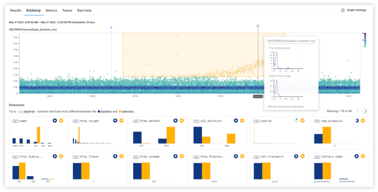
We could then identify the underlying user need. In the BubbleUp story, for example, I show that what we thought was a user need for query speed was actually a need for understanding data shapes.
A successful project builds just enough to test out the idea, gets it in front of users, and iterates. There are many forms of carrying out user research to test out a prototype – ranging from interviews, to lab experiments, to deploying placeholder versions behind a feature flag. The goal is to find signal as quickly as possible that an idea is working, or not, as the design change marches toward release (or is mercifully killed.)
Over time, the prototypes begin to look more like real code. Hopefully, the process of putting versions into user hands is beginning to show what work will have to be done to the real product.
While there are lots of difference between the academic and industry context, the commonalities far outweigh the differences. Some of the lessons that I’ve learned from both of these:
Choosing an appropriate problem is a blend of intuition, qualitative, and quantitative signals – and must be validated with data. It’s far too easy to pick the low-hanging, most obvious challenge.
Finding a solution in the design space is where domain expertise can be invaluable. My background in visualization often means that I can point to other solutions in the space, and can figure out how to adapt them. As the adage goes, “great artists steal” – a solution that someone else has used is likely to be both more reliable and more familiar.
It’s critical to protoype with ecologically valid data. It’s far too easy to show how good a design looks with idealized lorem-ipsums and well-behaved numbers – does that model the user data?
The best way to get that ecologically valid data is to iterate. Get feedback from users as rapidly as possible – and, if possible, reflecting their own data. Learn, iterate, tweak the prototype, and try again. (Even in academic papers, the section about “we built a prototype to test a hypothesis” usually hides a dozen rounds of iteration and redesign, as ideas that looked great on paper turn out to encounter subtleties when they become real.)
When you know you’re going to measure your prototype, you build in instrumentation from the beginning – state up front what you’ll want to measure, and then make sure you leave in hooks to read it back later.
Conclusion
This cycle of measure-design-try-measure is the core of every project I’ve built. Knowing that we’re working in this cycle drives the decision cycle – what questions do we need to solve at each iteration? how prototyped is enough? Reframing the discovery process through this lens helps guide the design process to create new, more exciting tools.
A Honeycomb Story: Five Different Kinds of Bar Charts
This blog entry continues my discussion of Designing With Data. You might enjoy Part I: “Designing With Data.”
I worked for Honeycomb.io as the first Design Researcher; I was brought in to help the company think about how data visualization could support data analytics.
At Honeycomb, I helped create an analysis tool called BubbleUp — there’s a great little video about it here. BubbleUp helps tame high-cardinality and high-dimensionality data by letting a user easily do hundreds of comparisons at a glance. With BubbleUp, its easy to see why some data is acting differently, because the different dimensions really pop out visually.
Today, I want to talk about three behind-the-scenes pieces of the BubbleUp project.
The Core Analysis Loop
When I arrived at Honeycomb, the company was struggling to explain to customers why they should take advantage of high cardinality, high dimensionality data – that is, events with many columns and many possible values. Honeycomb’s support for this data is a key differentiator. Unfortunately, it is hard to make an interface that makes it easy to handle that kind of data – users can feel they’re searching for a needle in a haystack, and often have trouble figuring out what questions will give them useful results.
Indeed, we saw users doing precisely that fishing: they would use the GROUP BY picker on dimension after dimension.
I interviewed several different users to understand this behavior. At heart, the question they were asking was, “Why was this happening?” and found that they were all struggling with the same core analysis loop : they had the implicit hypothesis that something was different between bad events and good events, but weren’t sure what it was.
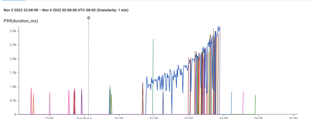
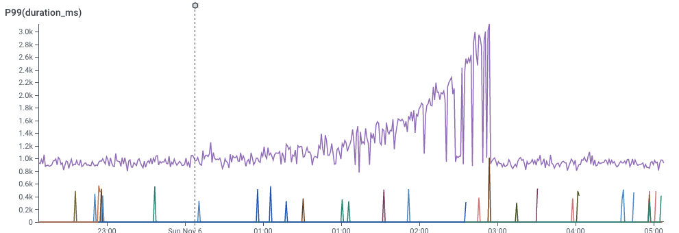
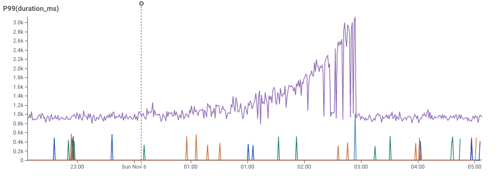
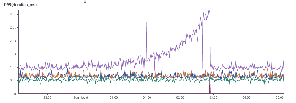
A graph showing 99th percentile latency for requests to a web service. Note that latency gradually increases to 2 seconds, then drops dramatically. This and following screenshots from Honeycomb.io
This, for example, is a screenshot of Honeycomb’s interface, showing the P99 of latency — that is, the speed of the slowest 1% of requests to a service. This gives a sense for how well the service is performing.
It’s pretty clear that something changed around 1:00 — the service started getting slower. This chart is an aggregation of individual events, each of which represents a request to the service. Each event in the dataset has lots of dimensions associated with it — the IP request of the requester, the operating system of the service, the name of the endpoint requested, and dozens of others — so its reasonable to believe that there is some dimension that is different.
It’s also pretty clear that the user can easily describe what happened: “some of the data is slower.” The user could point to the slow data and say “these ones! I want to know whether the events with latency over 1 second are different from the ones with latency around one second.”
We can look at a different dimension by dividing the data with a GROUP BY.
In the slider below, I’ve picked a few of the dimensions and did a GROUP BY on them. You can see that some dimensions don’t really give good signal, but one of them really does. That dimension would be the key to the puzzle — What would it take to find that more easily?
(By the way — you can try this yourself, at Honeycomb’s sandbox, which comes pre-loaded with data to explore.)
Rapid Prototyping
I love histograms as an overview technique – they show all the different possible values of a dimension. They give a quick overview of what the data looks like, and they are easy to compare to each other. Better yet, for my purposes, they don’t take up much space.
These histograms do, fact, take up space on your bed when you cuddle with them. (Technically, these are “evil distributions,” visualzed as smooth histograms. These are from Nausisca Distributions, but unfortunately not for sale anymore.)
You can compare histograms in a couple of different ways: you can put them side-by-side, or you can overlay them. (The pillows illustrate overlaid histograms, with dotted lines showing different parameterized versions of the distributions.)
I pulled sample data from our dogfood system. The quickest tool I had at hand was to throw it into Google Sheets, and drew histograms one at a time, choosing whatever settings seemed to make something useful, and cutting and pasting them over each other. (I could tweak parameters later. Right now, it was time to just build out a version and see if it worked.) Even with this primitive approach, I could see that some dimensions were visibly different, which meant that maybe we could use this technique to explain why anomalies were happening.
One of the first sketches of comparing distributions in Google Sheets, comparing anomalous (orange) data to baseline (blue) data.
First, it’s pretty clear that there’s some signal here. The “endpoint” dimension shows that all of the orange data has the same endpoint! We’ve instantly located where the problem lies. Similarly, the “mysql_dur” dimension shows that the data of interest is much slower..
We can also see that there are a few tricks that will need to be resolved for this technique to work:
On the top-right, we see that the orange dataset has much less data than the blue dataset – perhaps only six values on that dimension. We’d definitely have to solve problems of making sure that the scales compared.
The middle-left shows a bigger problem: there’s only one distinct value for orange. It’s squinched up against the left side, which meant that I drew the orange in this sketch as a glow.
The fact that we got real data into even this low-fidelity sketch meant that we could start seeing whether our technique could work.
To learn more about future blockers, I implemented a second version as a Python notebook. That let me mass-produce the visualizations, and forced me to face the realities of the data. Axes turned into a mess. Lots of dimensions turned out to be really boring. Some dimensions had far too many distinct values to care about. Some had too few — or none at all.
An image from a python notebook prototyping BubbleUp.
The Python notebook let me start exploring in earnest. I added a handful of heuristics to the notebook to make them less terrible — hiding axes when there were too many values, dropping insignificant data, and scaling axes to match — and now we had something we could start experimenting with.
My first step was to build a manual testing process. I’d export data from a customer account, import it into the notebook, export the output as a PDF, and email the PDF to a customer. Laborious as it was, it got us feedback quickly.
This experience proved to me that it was our users were, in fact, able to identify anomalous behavior in their data — and that this visualization could pin it down.
Of course, that also meant we found yet more strange ways that our customer’s data behaved.
Handling Edge Cases
The version of BubbleUp Honeycomb ships today is very different from this primitive Python notebook. The early iterations helped us figure out where the challenges were going to be.
We came up with answers for …
Times when the two groups were radically different in size
Times when one group was sparsely populated, and the other was dense
How we order the bars, including which graphs should be alphabetical, numerical, or by value.
What we do about null values.
How we order the charts relative to each other.
One interesting implication is that BubbleUp today actually has five distinct code paths for drawing its histograms! (I certainly didn’t anticipate that when I put together that Google sheet.)
Low-cardinality string data is ordered by descending frequency of the baseline data, and gets an X axis
If there are more than 40 strings, we stop drawing the X axis
… and if there are more than ~75, we trim off the least common values, so the graph can show the most common of both the baseline and the outliers
Low-cardinality numeric data is not drawn proportionately, but is ordered by number — with HTTP error codes, for example, there’s no reason to have a big gap between 304 and 404.
High-cardinality, quantitative data is drawn as a continuous histogram, with overlapping (instead of distinct)) bars.
None of this would have been possible without getting data into the visualization rapidly, and iterating repeatedly: there’s simply no alternative to experimenting with user data, interviewing users, and iterating more.
The BubbleUp interface today. It’s gotten a lot better then that first Python notebook, and shows data in a much easier-to-understand way.
Designing With Data
It happened again, just a few weeks ago.
I drew a great sketch in my sketchpad that could be The Visualization. The one that would help my users make sense of their data, simplify complexity, and wipe away all the layers of confusion.
I could almost hear the angels singing in the background as I coded up the first draft and spun up the system. I was ready to send the triumphant Slack announcement – maybe phrased with a humble “I think I might have made a little progress” but really knowing the answer was Right Here grasp. It looked good on some test data that I made up, but that seemed to confirm I was doing the right thing.
Then I threw actual user data into the visualization and everything collapsed.
Lines everywhere. Colors that made no sense. Axes that bunched lots of data into one corner and left everything else empty.
It turns out I had some beliefs about how my data would behave, and had made some implicit assumptions about distributions; it turns out that real data acted nothing like it. There was no way my clever idea could show what I hoped – at least, not without some serious re-thinking.
I’m not giving you details on this particular failed attempt because I would have written this a week ago, or a year ago, or five, and it would have been true every time. The clever graph simplification failed because the data wasn’t really as acyclic as it seemed. The clustered barchart that fell apart because some users had thousands of categories. The comparison that tried to compare dozens to millions.
Nor am I alone in making this mistake. A few years ago, a colleague had a clever idea of playing back the history of bug fixes as a game of space invaders: relentless bugs marching downward; heroic developers shooting them down one at a time. Then they looked more carefully at the data: sometimes hundreds of bugs would be wiped away with a single check-in (or erased with a WONTFIX); some bugs would linger for months or years.
Reality, it turns out, is never as well behaved as design wants it to be. This seems to be a particularly prevalent problem with data-driven design.
I’m far from the first to notice this! The paper Data Changes Everything (Walny et al, 2019) points out the mismatches that come when designers imagine what a visualization might look like, but without a good sense of how the actual data will behave. Among other things, the paper suggests building stronger collaborations between designers and data engineers.
I would generalize this, though: in data-intensive projects, your user’s data will behave in entirely unexpected ways.
I care about this because I create analytics tools for users. I’ve been re-learning this lesson for my entire career. I started off as a researcher at Microsoft, designing data visualizations. There, I designed tools for people to carry out data analyses – and found unexpected data gremlins hiding in almost everything I touched, from map data to user logs data.
Then I went to Honeycomb, a company that builds tools for DevOps. I had a more specific audience, and goals – and I still re-learned this lesson. Our users’ data embodied different assumptions than we had made in designing our system, and we needed to design our visualizations to be robust to their needs.
This is the first in a set of blog posts where I’ll try to tell a couple of different stories about reality and data colliding with previous expectations.
I’ll give you a spoiler, though: my advice is going to be the same – iterate rapidly.
My goal is:
Get real data flowing through your protoypes and designs as quickly as possible
Use the data to solve real problems as quickly as possible
Get real users to ask questions of their data with your system as fast as possible
I’m willing to compromise on a lot to get these steps done. Do we need to write the prototype in a Python script that draws a PDF file? Good enough. Does the output require us to reassemble images into a flipbook? No problem. Whatever it takes to get a sense, as rapidly as possible, about whether our assumptions match the way the data works.
Lets talk.


